- Home >
- Blog >
- Digital PMO >
- How to Implement a Digital Dashboard
Table of Contents
How to Implement a Digital Dashboard
A digital dashboard is an interactive data visualization tool that, using a BI tool, provides a consolidated view of key performance indicators (KPIs) and other relevant metrics. Blindly implementing a digital dashboard often leads to the risk of dissatisfied stakeholders or a waste of time for those who were involved in the process. Here are several essential steps to optimize such a project (and to understand even before opening a BI tool).
1. Identify your stakeholders and understand their objectives.
Before diving into the technical aspects, it’s essential to clearly define the purpose of the digital dashboard. This step is crucial because it enables you to determine which key indicators are important to drive and achieve your stakeholders’ objectives. Their expectations must be integrated into these objectives and hence the KPIs. This helps to define the scope, understand who the users will be, and to identify which KPIs to track. Knowing these will simplify the dashboard development process.
2. Identify your data collection sources.
Gathering the necessary data from various sources, such as databases, spreadsheets, cloud services, and APIs is the next critical step. Data can be stored in various forms (Excel files, internal databases, Web services, etc.) depending on the organization. It can also be easily collected by various BI tools, which nowadays support a wide range of data sources. For ease of maintenance, however, ensure that these sources are stable and that the structure of the data does not change.
3. Determine the best BI solution.
Selecting the appropriate BI tool is not often a choice, as it is rare for a company to have several tools available for many reasons (costs, corporate strategy). Nevertheless, if this is the case, it’s important to know the scope of the dashboard in terms of longevity, number of users, data support, update frequency, etc. All these criteria will help you choose the ideal solution. Of course, it’s important to ensure that this solution is compatible with the data source as well.
For a comparison of different BI tools, read our article Business Intelligence Tools: How to Choose the Right BI Tool for your Dashboard.
4. Prepare the Data
Data preprocessing may involve cleaning, transforming, aggregating, and modeling the data to create a unified dataset for the dashboard. Data quality is essential to provide reliable performance indicators and decision making. Data cleaning and transformation aim to ensure this quality, and BI tools often offer data preparation features to assist with this process. The model allows you to create relationships between different data tables, thereby enabling visualizations to cross-reference data from different sources.
5. Design visualizations and integrate them into your dashboard.
The design of your digital dashboard plays a significant role in user engagement and comprehension. A large number of visualizations (such as charts and tables) as well as interactive elements (such as filters) are available by default in BI tools, meeting the needs of the vast majority of users. This part is much easier if the previous steps have been properly implemented. While creating the visuals, it’s important to also reflect on the overall aesthetics of the report to facilitate reading and navigation.
Note: For a dynamic dashboard, consider integrating real-time data feeds to ensure that the dashboard always reflects the latest information.
6. Validate and test the dashboard.
Before deploying the dashboard into production, it is important to ensure the consistency and reliability of the results. Running several types of tests ensure the dashboard is robust: functional testing (filters, interactions, sorting, etc.), performance testing (fast opening/load time, reactivity), security testing (access rights). Engage with stakeholders and potential users to gather feedback and make adjustments to optimize the dashboard’s effectiveness.
7. Deploy and maintain the dashboard.
Now that the dashboard has been developed, we can move on to the deployment phase. First of all, the dashboard must be accessible to the intended users, and hence, make sure to assess and apply the required security levels for each access group.
Secondly, users must be trained. A good practice is to provide a user guide, but depending on the complexity, specific training may be required.
Finally, the dashboard needs to be maintained and improved. This includes correcting errors, regularly updating the data, accommodating business needs, and identifying opportunities to improve the dashboard.
Example Cases
Let’s consider two examples of implementing a digital dashboard:
1. Simple BI Solution: Transitioning from Excel-PowerPoint based reporting to a Power BI dashboard
Historically, KPIs have been calculated in Microsoft Excel and presented using Microsoft PowerPoint. Although highly effective in their respective fields, these tools are not ideal for dynamically calculating and visualizing KPIs, as they offer little interactivity and customization. Today, a BI solution is preferable in this situation.
Going back to our 7-step implementation process, let’s assume that our stakeholders have already been identified. Perhaps they are executives looking for project status updates.
Regarding the data sources, let’s consider an Excel file with numerous sheets: one or more databases, pivot tables, graphs, reference tables to enrich the data. However, for communication and management purposes, only the key performance indicators are relevant, so these are often shared in a PowerPoint file by e-mail or in meetings. These are the indicators which will be integrated into the dashboard.
This brings us to step 3, picking the right BI tool. Since Power BI is part of the Office suite, it is often the gateway to the world of Business Intelligence to replace the Excel/PowerPoint double solution. Indeed, Power BI allows you to highlight visuals (better than Excel) while keeping data in the background (better than PowerPoint). So here, we’ll be using Power BI.
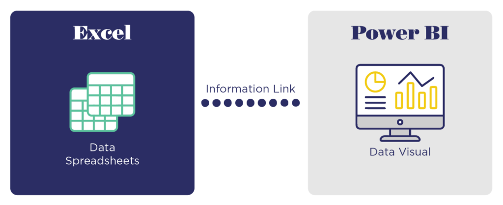
Next, to prepare the data (step 4), connect and import the data from Power BI’s wide range of possible data sources. (See Figure 1 as an example of connecting data from Excel.) If the data is already cleaned and well-organized for visualization, move right into step 5.
However, most of the time, the database must be enriched or transformed. If you need to complete your database (e.g., there’s a zip code column and you need the corresponding city) or to transform it (e.g., extracting the first 3 letters of a column), then you’ll need to use the Power Query editor or the DAX language, which allows a wide variety of transformation operations on the data, making the performance indicators all the more relevant. To do this, some training may be required to master these operations.
Whatever the case, the visualizations created will be ideal for dynamic communications and precise management. Moreover, Power BI includes a publishing function that allows you to easily distribute the dashboard by making it accessible in a few clicks, via SharePoint for example.
Therefore, after designing, testing, and deploying your dashboard solution (steps 5-7), the elements once reported through PowerPoint will now be available with dynamic and real-time data.
2. Advanced BI Solution: The gateway to professionalizing digital dashboards
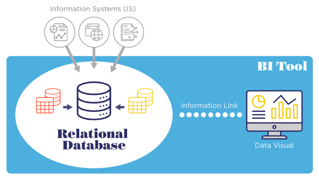
When it comes to integrating a BI solution into an organizational ecosystem, the number of data sources as well as the data preparation and modeling become significantly more complex. For this, it is possible to develop a solution with an integrated architecture, where a BI tool connects to a single centralized database called a relational database (Figure 2) or to a data lake (Figure 3). For either setup, the data can be stored in the cloud or on premises (on prem).
An on-premise solution consists of storing data on company servers.
If an organization’s information systems and data are stored on-premises, then a relational database works as a unique source for a BI tool. This enables a controlled environment for data processing and circulation. (Figure 2)
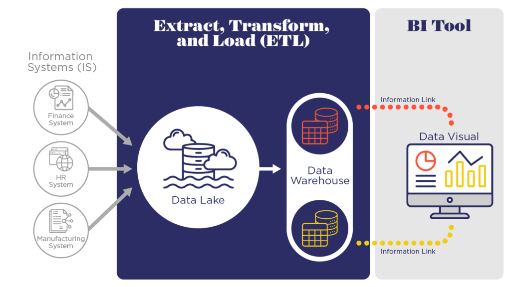
When it comes to multiple systems and data sources that are difficult to organize in one place, however, a cloud solution can be developed by creating a data lake.
A data lake is a virtual place where a considerable amount of data is stored, mainly from the company’s various information systems (IS). Usually, it is a restricted access environment as it hosts all data in mostly a raw format.
The data is then transformed in a simplified and structured format by creating a data warehouse and/or data marts.
A Data Warehouse is a place where structured data is created by identifying relationships between data elements.
This becomes the source for the BI tool, instead of connecting and collecting data from individual data sources. It makes the data available for the BI solution, even if the source systems are experiencing downtime for maintenance reasons. (Figure 3)
For guidance on selecting the appropriate BI tool, please refer to Business Intelligence Tools: How to Choose the Right BI Tool for your Dashboard.
Conclusion
Implementing a digital dashboard using a BI tool is a powerful way to transform raw data into actionable insights. It allows for a robust reporting system that supports a wide range of business needs, including but not limited to project milestone management, incident/problem tracking, workload/resource matching, budget monitoring, and even corporate planning and reorganization.
By following the step-by-step process outlined in this article, a visually compelling and informative dashboard can be delivered to empower your organization to make data-driven decisions. Remember that the success of a dashboard depends on careful planning, thoughtful design, and continuous refinement.
Begin your journey by following these steps, or partner with us to deploy these capabilities within your organization.


